Ethan Le Sage
This is an ultra-low-emissions website, inspired by Low-Tech Magazine. This page has a total size of ~19KB. Learn about this site's efficiency here.
Home | Contact | Resumé | Projects | Website Portfolio


This is an ultra-low-emissions website, inspired by Low-Tech Magazine. This page has a total size of ~19KB. Learn about this site's efficiency here.
Home | Contact | Resumé | Projects | Website Portfolio
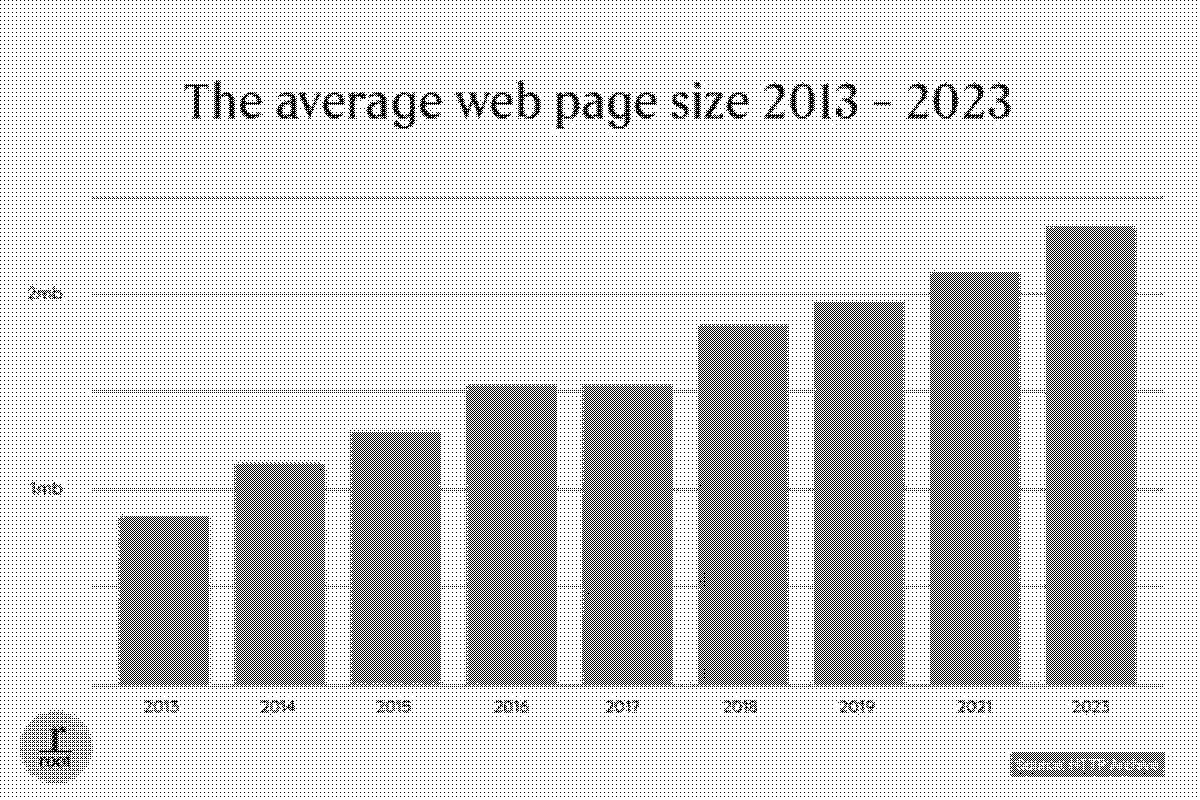
Over the past decade, the average web page has more than doubled in size, to over 2MB. As devices and networks have grown faster, there is less incentive for developers to create fast, clean frontend code. This site was built as an experiment to address some of these issues here, on my own personal site.
As mentioned in the header, this site is inspired by Low-Tech Magazine. The magazine, run by Kris De Decker, addresses real-world issues with old, often forgotten technology. The motivation for these solutions are largely environmental. Recently, the magazine switched to a solar-powered website, which was built to use as little bandwith and processing power as possible. Seeing this site made me realise that my previous website was unnecessarily bloated, so I embarked on a project to apply the same thought process here.
My aim with this new site is to preserve almost all features and information from my old site, but with as small a page-size as possible. A more arbitrary goal is that I would like to have an average page size of less than 20KB. (Less than 1% of the size of the average web page). Along the way, I have also created a low-tech CSS framework, so that the guiding low-impact principles from this site can be applied easily to others.
In tandem with this site, I developed a 1KB CSS Framework to enable others to make low-emissions sites more easily. This framework is now complete. It provides all you need to gain a complete structural layout of your site, before writing any custom CSS. It is worth noting that this framework is designed to provide structure to an HTML page, but is not intended to provide complete styling. You can see the framework here.
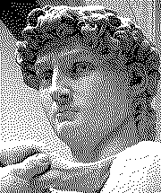
To keep image sizes small, an obsolete compression technique was employed, called dithering. Dithering is a technique used to enable viewers to see a large range of colours in an image, where only a small subset of these colors are available. Think of that one scene from Ferris Bueller's Day Off.
One notable use of this technique is in newspapers, where only two colors can be drawn on a page (black or white).
On this site I have used it to create images with 1-bit colour depth.
Overall image quality is significantly reduced, but crucially, so are file sizes.
If a picture says 1000 words, then the pictures on this site probably only say 100, but that's good enough.
An example of this can be seen alongside this text (just 4.15KB).
Note how, when you zoom in, all pixels are either black or white.
Despite this, when zoomed out, the image appears to use varying monochromatic shades.
Every HTML and CSS file served by this site is minified before compression with Gzip.
Minification is a process which reduces file sizes by removing all comments and whitespace from the code.
Gzip is a type of compression used on the web to minimise file sizes.
It is typically only employed for HTML and CSS files, however for this site it is enabled for all file types except .png.
There are other types of web compression that can reduce file sizes further than Gzip, namely Google's Brotli, however this was not chosen because Gzip is compatible with more legacy browsers and devices.